This is the fifth and last post in my blog series about building a real life moving castle. I’ve interwoven this text with pictures and videos – they’re there to deepen the subject. The text is written as a standalone, so you can skip them if you like.
The design, especially interior design, is the area I believe the builders will have their biggest challenge. Not because there’s some deeply complicated physics or mechanics to solve. Indeed, the problem has already been solved over and over. But because the persons who build walking houses today usually don’t like country romance styles (ie. shabby chick, CottageCore and similar). That’s not a bad thing, preferences are preferences, but if you’re into raw industrialism or brutalism you haven’t developed the skills to design a cosy little cottage. Moreover, you probably won’t chose this style unless someone is waving around a very thick wad of money.
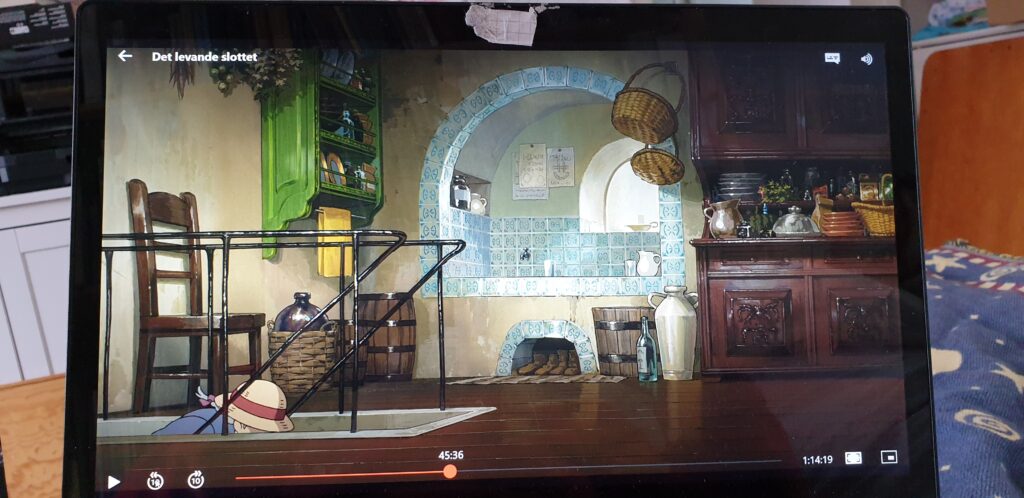
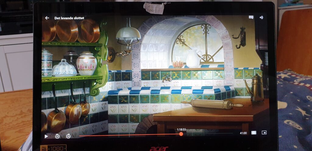
Is it necessary? Yes, because the pull of Howl’s moving castle is not just that it moves, it’s also because it looks dang cosy while it does. The studio designed the castle to be a mix of country style thatched houses, steampunk, and a dash of Terry Gilliam on the outside. Inside we see the combined kitchen and living room mostly, in the beginning furnished in an eclectic rustic mix of furniture and mess. A lot of people I met talk about Calcifer’s fireplace, with the Grief and Joy wood rack and the sun deity on the wall behind him. But take a look at the washbasin in the wet corner – the tiles are just as much a statement piece. Or the carved cabinets with flower and leaf motifs.


Studio Ghibli designed the castle from the premise that it consists of things Calcifer cobbled together as the contraption/character grew. If you look at the inside a lot of the furniture and things are from Howl’s life. The overall style is reminiscent of the cottage where he spent his summers, the illuminated books and chemistry equipment (all good fantasy wizards seem to dabble with chemistry) are from his wizard studies, and a lot of furniture and wall hangings look like things he could have inherited from relatives. When they move, and Howls literally makes room for Sofie, he adjusts the style to what he knows about her. The castle interior goes from a middle European rustic country style to a more wealthy European early 20thC middle class style. (Sofie doesn’t seem to be entirely happy with the latter – it’s a shame we’ve never granted a look inside the flying castle, it would have been interesting to see what studio Ghibli though would be her adjustments.)
It would be easy to write a “steal the style”, but it would also be to miss the point. The castle is built around the persons living inside it. Some things stand out; the country style castle has terracotta jars, cast iron, and simple tapestry hangings, the middle class castle has porcelain jars, copper cookware, and framed paintings. Very little is only for decoration, but every utility item is decorated or decorative. These are things that get used and survives. Likewise I’ll build my own project around myself. Since I’ve lived for a long time I’ll basically just have to remove the things not castle worthy.
If I was twenty again I’d go thrift shopping a lot. It’s a great way to find things that are “off the beaten path”, and – especially – things that can survive tough turns. But I wouldn’t avoid places like IKEA, Muji, or Target. Modern style mass production has been around since the 16thC so there’s definitely mass produced things in the castle. The important thing is to pick things that are useful, beautiful, and sturdy to form a personal mix of things. Oh, and flowers as decoration can never be wrong – Ghibli is crazy about flowers.
But what if we had an artist build the walking house, wouldn’t their creation become as quirky as Howl’s castle? Hm, well, the answer to that question is a resounding “NYES!”, because the walking houses that exist are built by artists. Let me first introduce you to the N55 Walking House – the inspiration for my own project. I’ll probably borrow a lot of their ‘leg work’ to mine, since it’s both logical and seem to be low cost energy wise. (They claim to power the house solely on wind and sun, though I haven’t been able to find any blueprints or calculations on how that’s possible.)
Design wise it’s far from the eclectic mess and cosyness of the Ghibli movie, it’s rather a sleek, minimalist industry design. It’s made up of a black hexagonal tube, with an interior that only works for completely able-bodied persons. Howl’s moving castle isn’t that accessible either, but it has stairs. As for N55 you enter the house through a section of an end window, and unless you climb onto the sleeping loft you have to sit on the floor. Since the house is hexagonal in shape the floor makes up a rather small area, and you have two sloping areas leading up to the wall that neither works well as a floor nor a wall. The only “stair” to the sleeping loft is the flat area of the stove.
When I researched N55 I came across the question why it’s not being produced in greater numbers. So far it seems like only the prototype exists. I have no conclusive answers to that, but art projects are in general one offs. You do your thing, solve the problems, and present it to the world to ponder. As an artist you’re not necessarily interested in working with mass production for everything (printing artwork, yes – going through the cumbersome process of working with industry production of vehicles, not that fun). And I do think the sleek design has been a hamper. The Tiny House movement didn’t take off because the houses were portable – camping trailers were readily available – it took off because the first items were Cheap Cute Little Houses.
I should mention the Walking Pod designed by Scott Parenteau. I’m not sure he’s a full time artist, but the project was made for Burning Man which in itself is a gigantic happening. While it’s not a house it’s still a walking vehicle, and basing the walk mechanism on Strandbeests gives it a lovely smooth movement. While I’d love to use this for my own project the vehicle gets too broad. I have at most 2.5 meters to play with, and by the look of it this is closer to five meters from end to end. It would also be yet another deviation from the Ghibli aesthetics. If you look at the video you can see that the pod is industrial design only. Spot on for Burning Man, but not that cosy.
But we do have something that resembles Howl’s moving castle; the magnificent Grand Elephant of Les Machines de l’Îlle in Nantes. At twelve meters tall and eight meters wide it’s nearing the castle in size. Not road legal, obviously, but still moving. Here the design is impeccable, I love the balconies and the house gables on the side. The builders have even given the elephant sounds and the ability to spray water with its trunk. Unfortunately filming the insides isn’t allowed, so I can’t vouch for the interior design. And there is one teeny tiny drawback; it’s not actually walking. The entire thing is mounted on a motor cart, and while the legs are moving they touch the ground as little as possible to not mess up the drive. It’s a very good illustration to how hard it is to make a smooth four legged walk, especially with a big and heavy vehicle.
Will there ever been an actual walking castle built? It’s not impossible – we’ll have all the technology we’ll need in no time. Disney could certainly build one if they put their minds to it. And it may be a fool’s wish, but I hope the Ghibli theme park already is working on one. Given the plans to expand, and the sparse dioramas from the movie in the parts they’ve already built, I keep my fingers crossed it’s a sign they’ll add something big later on. As for my own project my own economy stalls it. Even a small house built on a bare bones budget requires funding only available to wealthy middle class (unless you work in mechanics and can borrow a large enough workshop). But if you are someone like Hacksmiths Industries and want to adopt me for a project, HMU – I’ll gladly help you with the design.
Lämna ett svar